Typeface + Zine
TYDE
Typography, Zine layout
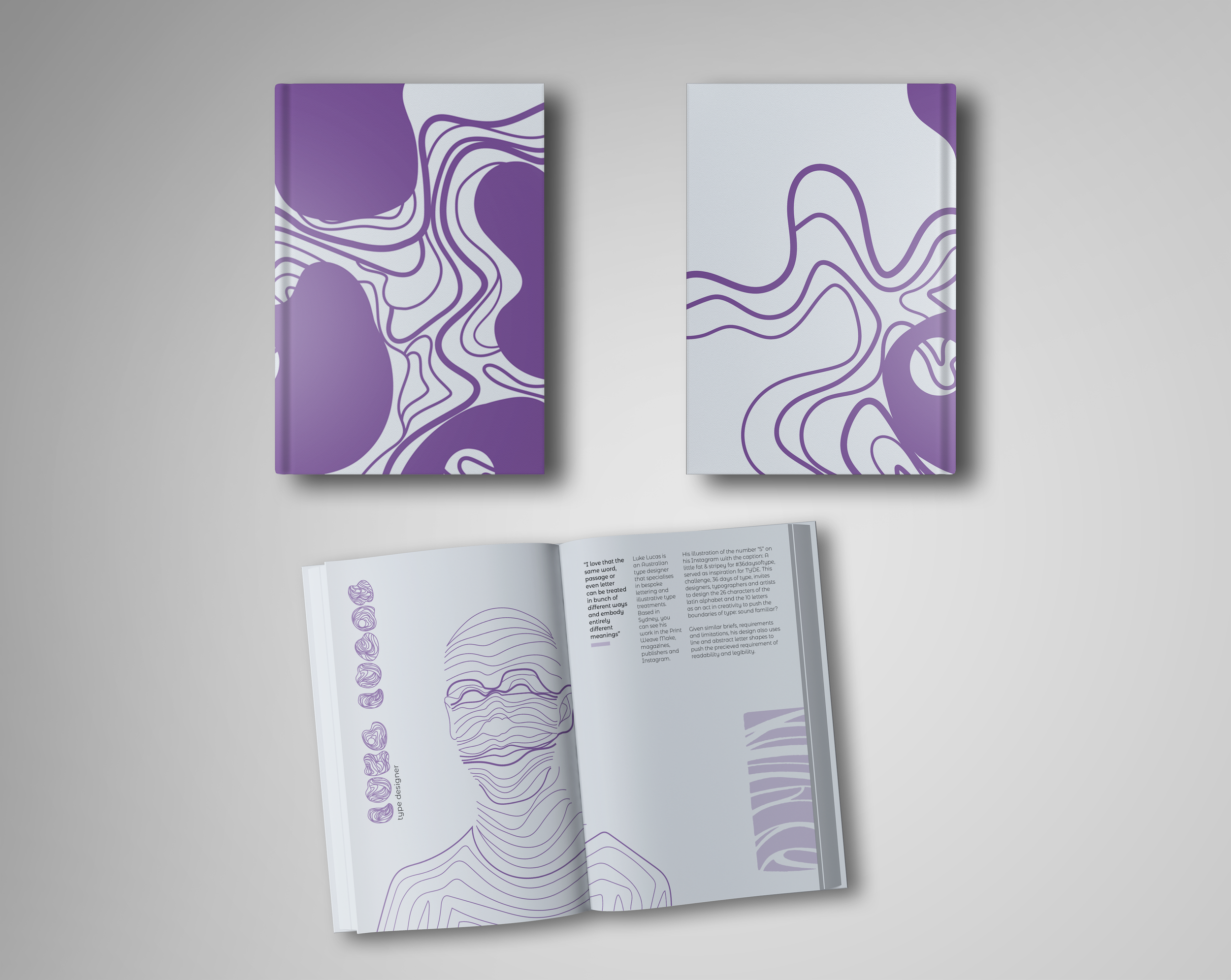
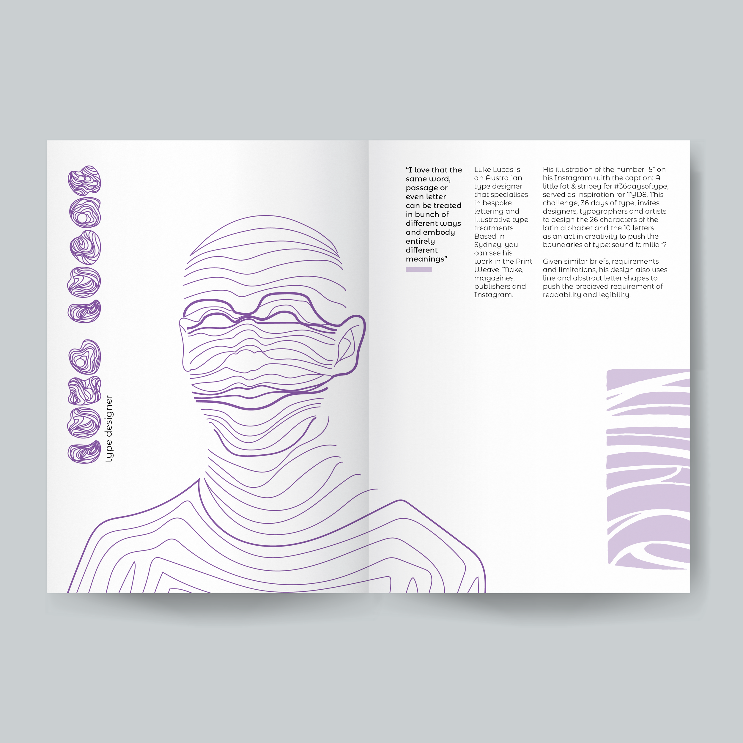
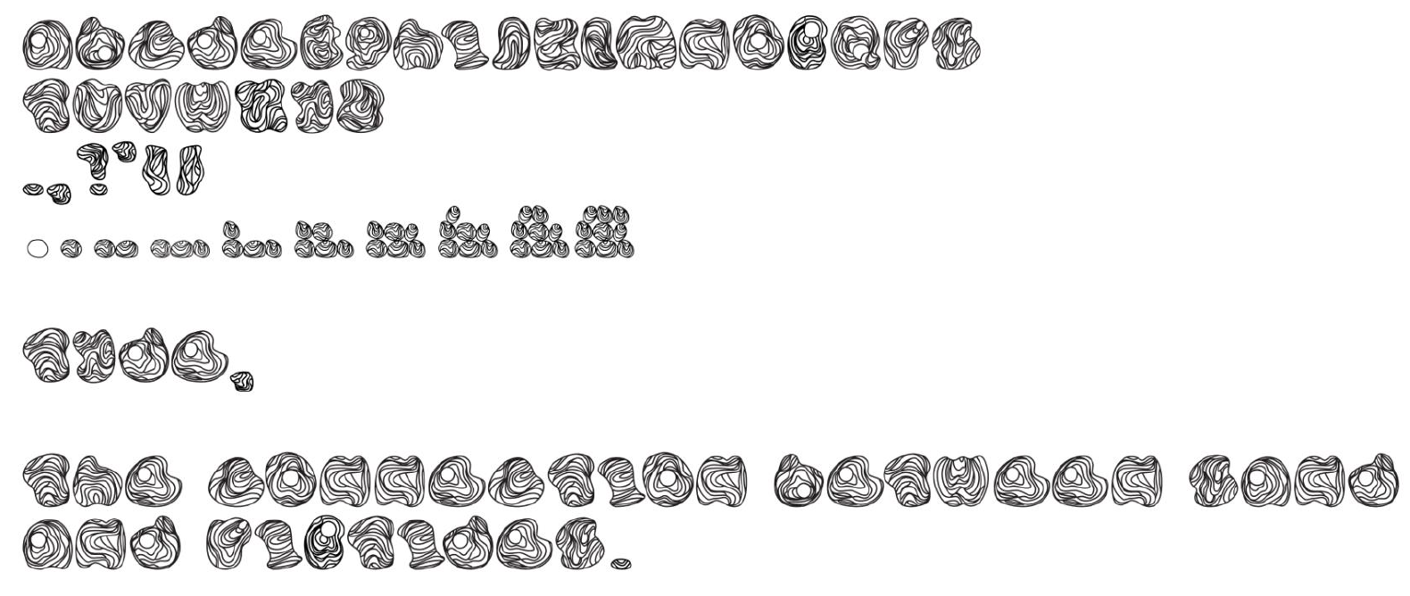
This is an abstract and expressive font that pushes the boundaries of legibility in a quest for innovation. Inspired by symbiosis, specifi cally sea water and currents that transform into riptides, the linework in each glyph represents the wild beast that the ocean is. Previously, fonts were successful if they were readable, but in this new creative age, typographic art has transformed how type used in design. Introducing: TYDE.
Role & Scope
Role: Type design, typographic exploration and zine design
Collaboration: Designed independently
Deliverables: Typeface in full English alphabet, numbers and 6 characters, and illustrated zine
The Challenge
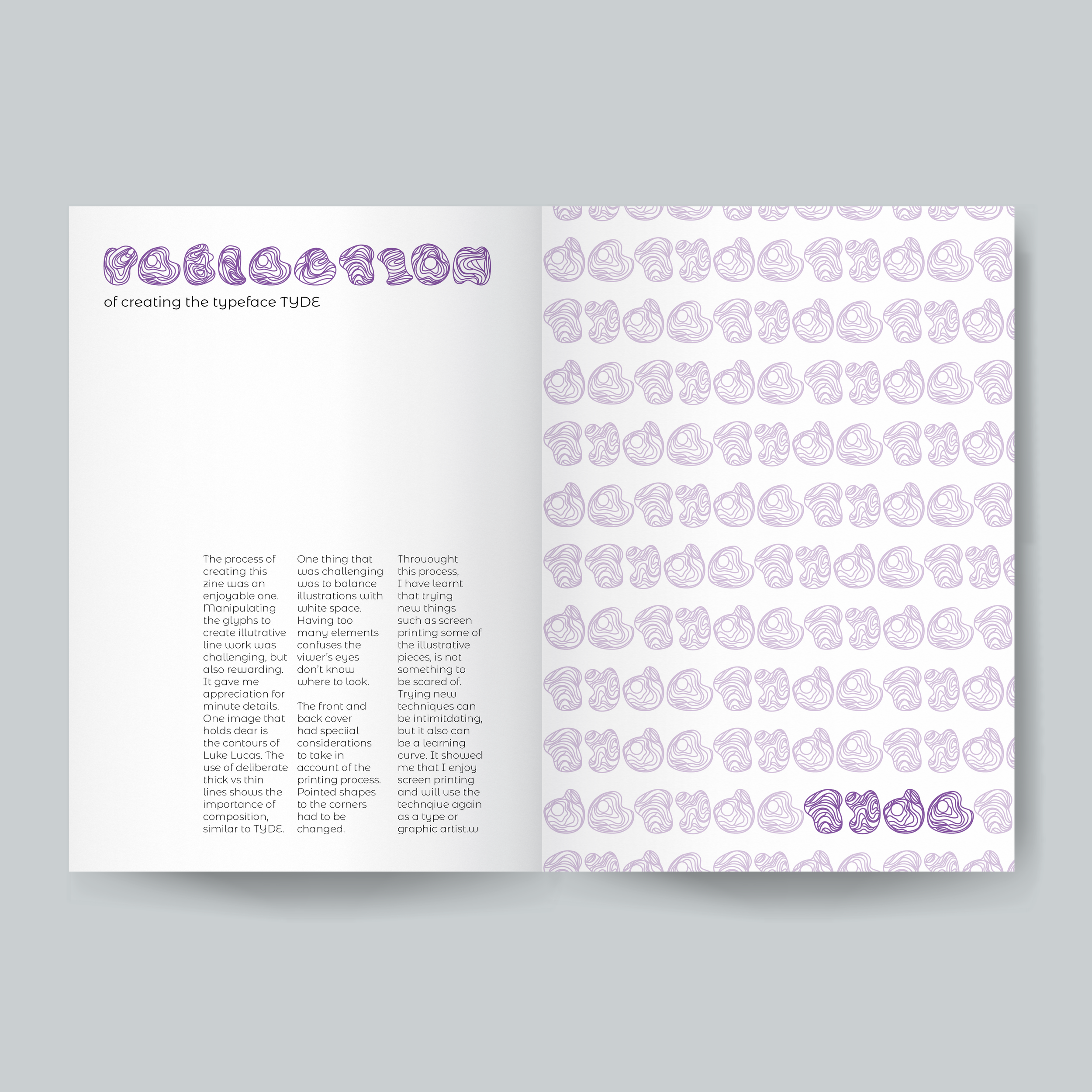
The challenge was to design a typeface that felt both expressive and functional — one that could hold its own as a display font while remaining readable across longer editorial settings. Balancing stylistic personality with practicality required careful attention to proportion, rhythm and consistency across characters, ensuring the typeface could support a range of typographic use cases.
Design Approach
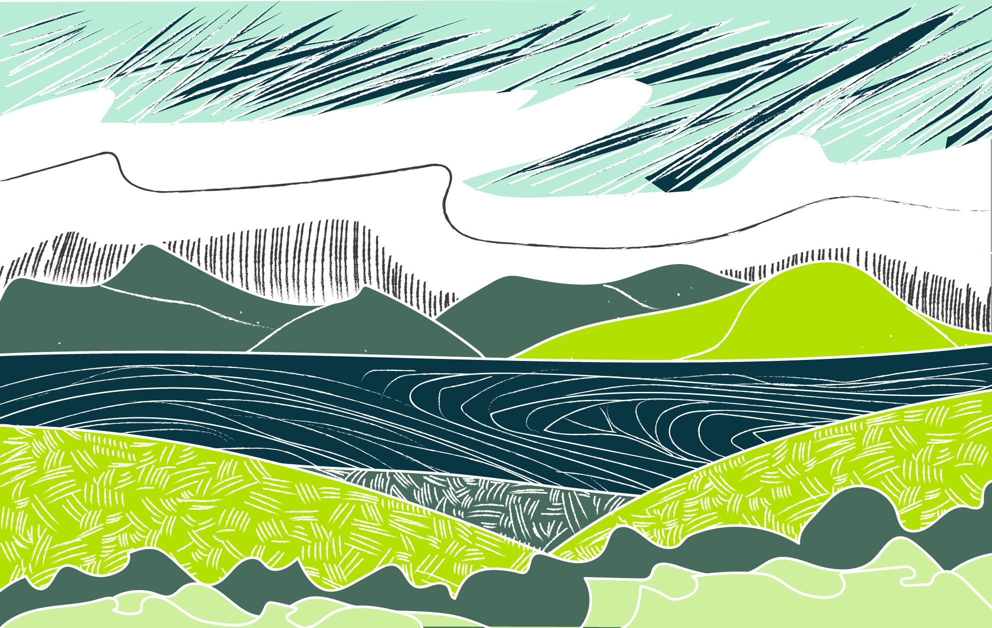
The design approach began with sketching core letterforms, testing foundational shapes and structures to establish a coherent typographic voice. From there, the alphabet was expanded systematically, refining curves, angles and spacing to ensure balance and harmony across weights. The typeface was then applied in editorial layouts that demonstrated hierarchy, contrast and overall story telling.
Selected Work
Outcome & Impact
The resulting typeface strikes a balance between character and clarity, supporting expressive editorial work while remaining highly legible. When applied across a zine, the design demonstrated clear hierarchy and visual cohesion, illustrating its potential for both brand expression and functional communication. The project stands as a strong example of typographic thinking and how the boundaries of type can be pushed.
More Projects
-
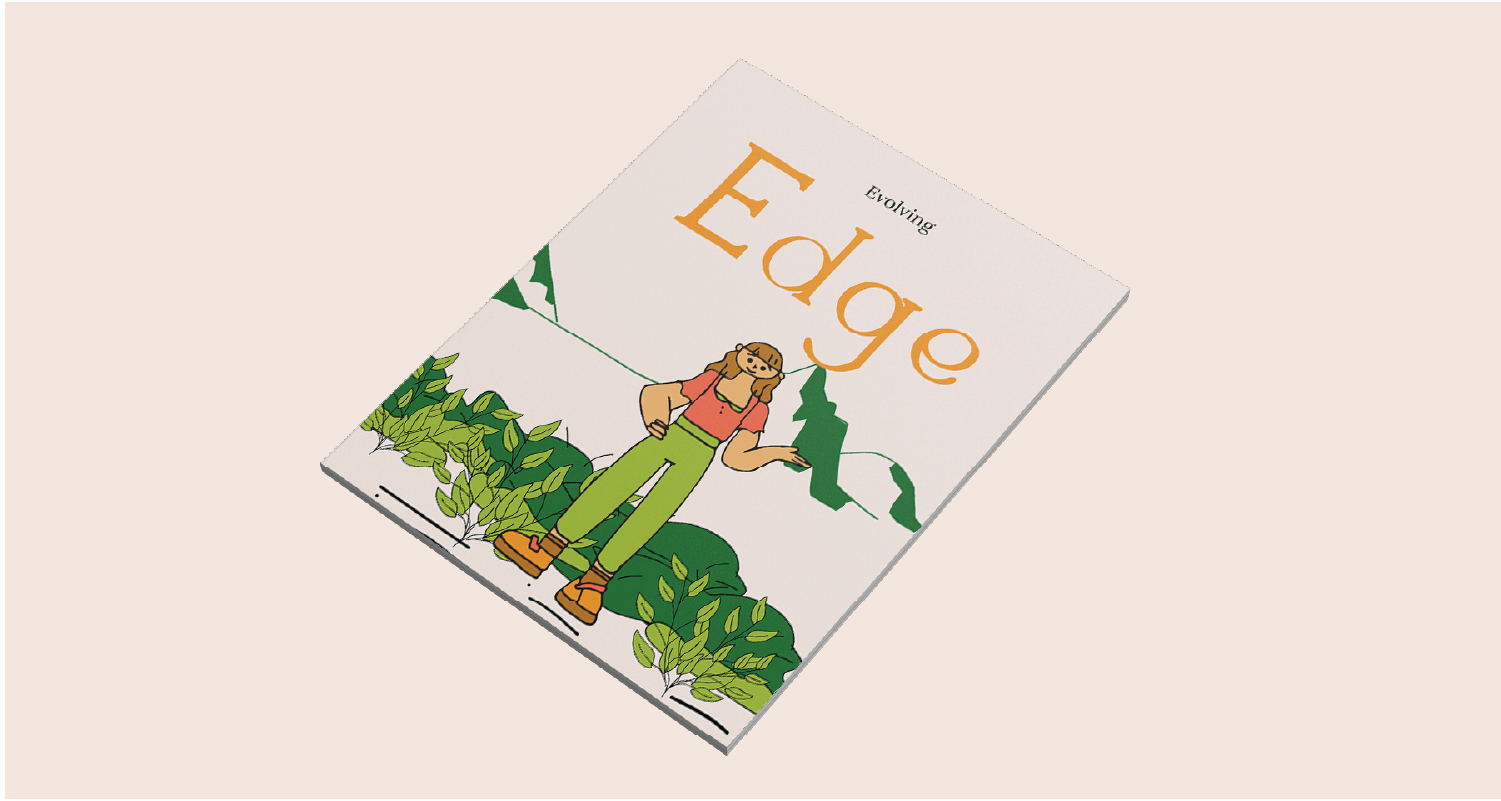
Evolving Edge Brand Identity
-

Plaîs Parent Concîerge Brand Identity
-
Mikey The Magpie Animation